To download the sample data in the video click here. Please see our Excel Dashboard training course if you would like this training delivered at your place of work.
A Bubble chart is a like a Scatter chart in that it combines two sets of data – x and y axis into a single point – however a third set of data is expressed by the size of that data point or the size of the bubble.
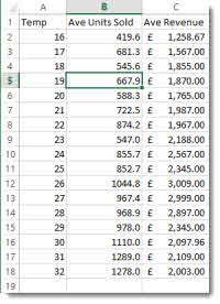
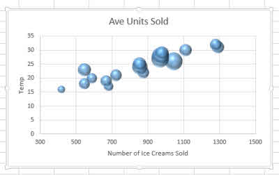
In our example we are looking at ice cream sales: we want to explore the relationship between temperature, the number of ice creams sold and the revenue from those ice creams. The temperature and number sold are plotted y and x respectively and the revenue is shown by the size of the bubble.
Creating the Bubble Chart
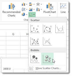
To start off, click anywhere in the data and then on the INSERT tab on the Ribbon in the Chart group, click the Scatter menu button. Select one of the Bubble chart types from the menu as shown below.
To see how Excel has used your data to construct the Bubble chart click on the Select Data button on the Ribbon’s Chart Tools DESIGN tab in the Data group. Then click the Edit button.
You will see Excel uses the first column of data as X values. The second column is used for Y values and third for bubble size.
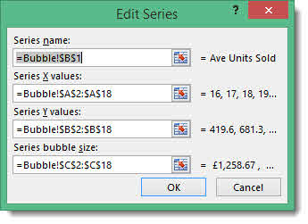
It might be worthwhile at this point swapping the x and y values so that temperature is shown on the vertical Y axis.
Changing Overall Bubble Sizes
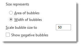
To improve clarity, you may need to change your overall bubble size – especially if your bubbles are overlapping. Easiest way to do this is to right-click on a bubble and select Format Data Series from the shortcut menu.
In the Format Data Series task pane there are a couple of sizing options. One allows you show size as area or width of bubble. The other allows you to scale your bubbles.
Here’s how my Bubble chart looks.
See the video for some more formatting options – you can even show the bubbles as images – for example ice creams!