A histogram chart is good at showing how your data is distributed. For example, if we had a data set showing how many daily hits a website received over a year, we might want to know how many days received between 100 and 150 hits, 150 and 200 hits, 200 and 250 hits and so on. This chart type is new to Excel 2016. Please see our Excel Dashboard training course if you would like this training delivered at your place of work.
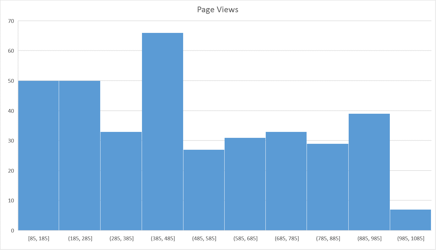
A histogram groups values into what are called bins. The default bin size is determined by a formula called Scott’s normal reference rule. More information on this can be found here
As well as accepting the default bin size you can also set your own.
Watch the video below for a demonstration on how to create a Histogram chart in Excel 2016. Download the featured file here.